Secondary research was done to understand industry trends and practices, and these formed the basis of our primary research which took place over various different methods:
Due to NDA reasons, this page needs a password to view it. Please contact gayatri.ketharaman@gmail.com for access.
That's an incorrect password!
Concept for digital transformation for a prominent US based health insurance company to enable them to be an one-stop solution for their customers overall healthcare and insurance needs.
Breaks in the healthcare landscape coupled with inaccessibility of information and multiple isolated entities in the space makes managing healthcare a painful, taxing process.
Analysing existing platform, discovery surveys and interviews with users and stakeholders. Workshops to synthesise and ideate, followed by visual design for prioritised solutions and qualitative testing.
A cohesive, personalised experience that integrated multiple entities to provide easy to consume health and insurance data and guidance to people on their health journey under one umbrella
Secondary research was done to understand industry trends and practices, and these formed the basis of our primary research which took place over various different methods:

Surveys:
Anonymous surveys were sent out to members of the provider, to understand more about their interactions, problems and expectations from the platform..

Interviews:
Qualitative research was done through user and stakeholder interviews to learn more about their needs with regard to health and insurance.

Heuristic evaluation:
The portal was evaluated according to heuristic principles to determine it's usability and the current pain points

Competitive study:
Direct and indirect competitors were looked at, and parallel world studies were done to draw relevant inspiration from other industries.
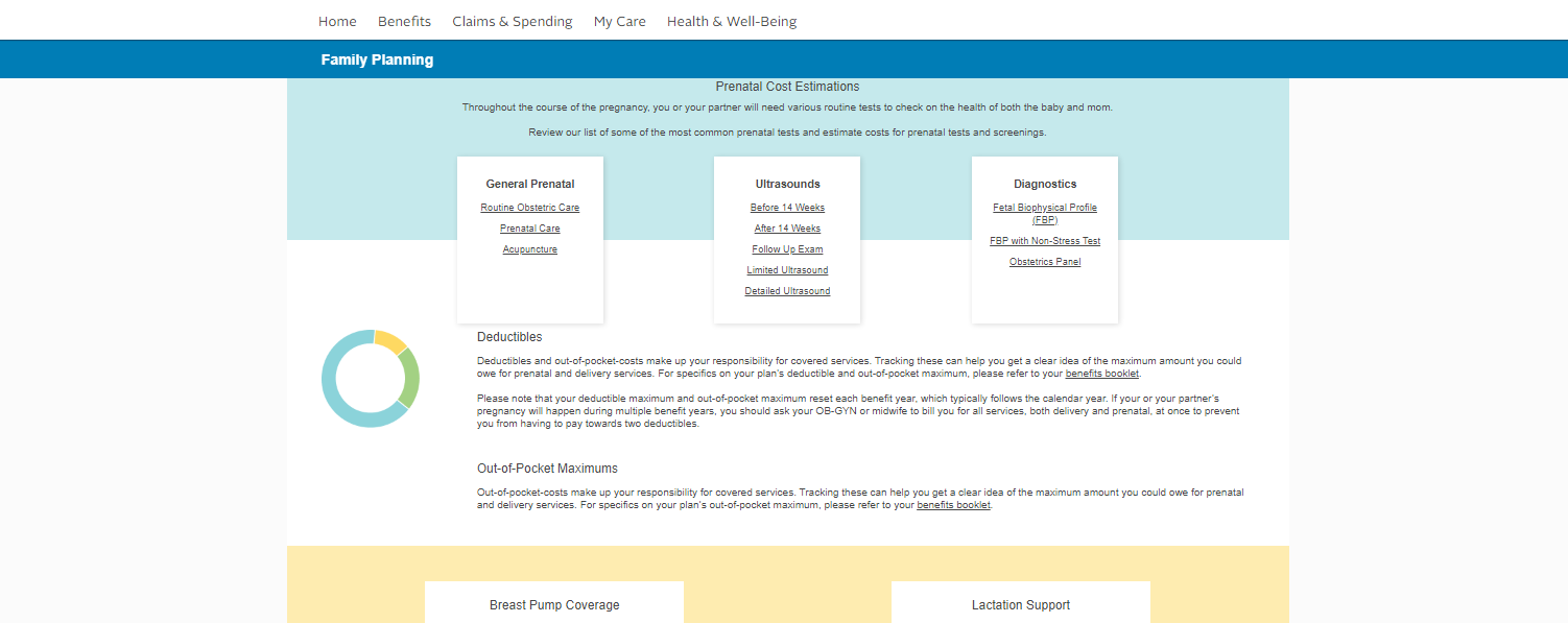
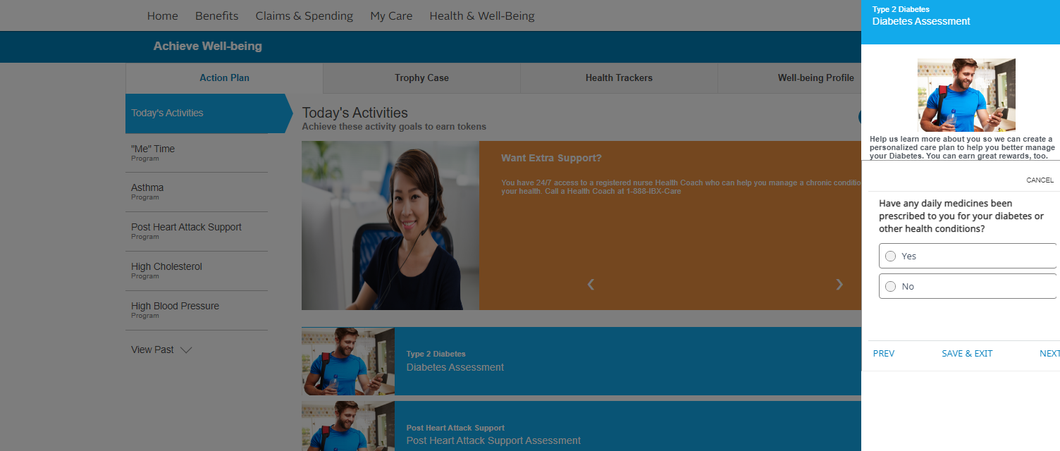
Lack of information transparency:
Details on claim rejection, earning rewards, costs are missing. Information about claim status and cost estimation make up more than half the customer care calls.
Messaging and system status:
Information finding becomes difficult in a vast portal without enough indicators to orient users.
Vague navigational terms, technical errors and jargon, lack of progress indicators make effective usage hard.
Lack of personalised content:
Many parts of the landing page are not relevant for some users or scenarios. This leads to them getting left empty or filled with random content that proves confusing.
Buttons and navigation:
Similar looking buttons react differently: opening information in flyouts, modals, in page and new pages.The navigation systems vary in different parts of the portal.
Transparency and communication:
Use of heavy jargon, difficulty in accessing important information leads members to simply renew existing plans without looking into what suits them best.
They prefer notifications specific to their insurance journey and unsubscribe if they're not relevant.
Mobile usage:
Less than 20% users use mobile regularly for this provider. This was although industry standards have mobile as a high access point.
The percentage of mobile users is low even for users aged 18-40.
Value adds:
Members often track their health and welless, and are willing to engage with the provider's digital experience above just insurance-oriented actions.
However, they now only use it when there is a major life event, illness or issue resolution.
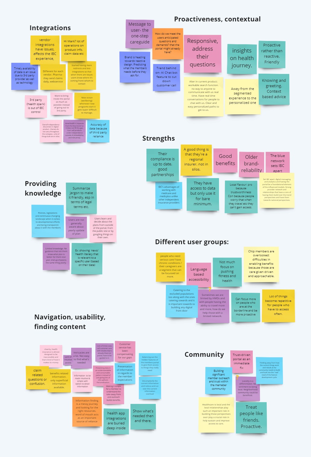
Faulty integrations:
Inaccurate, inconsistent integrations with third parties lead to difficulty in navigation and finding data, as well as broken visual language.
Inaccurate data sharing leads to confusion and difficulty addressing queries.
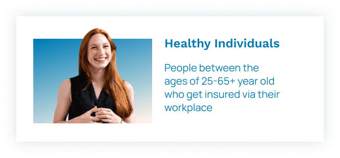
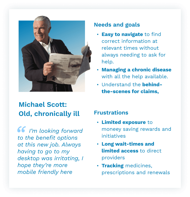
While most people use the platform for similar usecases and processes, different personas have different priorities, entries and motivations for their insurance.
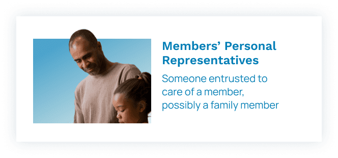
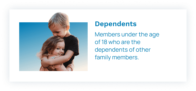
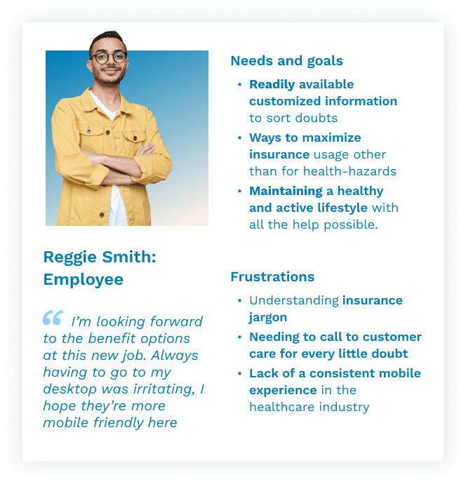
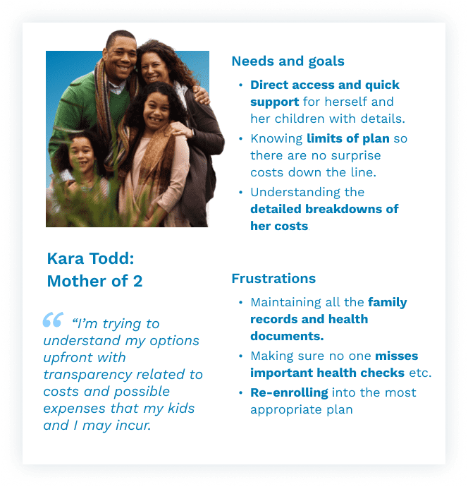
The journey of a typical user across all stages of interacting with the service was mapped out collaboratively with key stakeholders, to determine exactly how customers interact with the platform, where issues arise. This starts with awareness and decision making, onboarding and usage, all the way to renewal and ambassadorship, and was used later on to synthesise problems and create concepts.
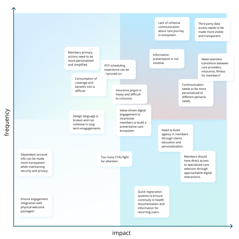
HOW MIGHT WE
Visual and data continuity between different entities in the care ecosystem. Seamless onboarding for new and returning members.
HOW MIGHT WE
Timely and intuitive information presentation focussed on the specific needs of different personas. Insurance terms explained in an accessible, consumable manner.
HOW MIGHT WE
Incentives and value additions to ensure interactive, regular engagement. Making access to specialised care and wellness more approachable and transparent.
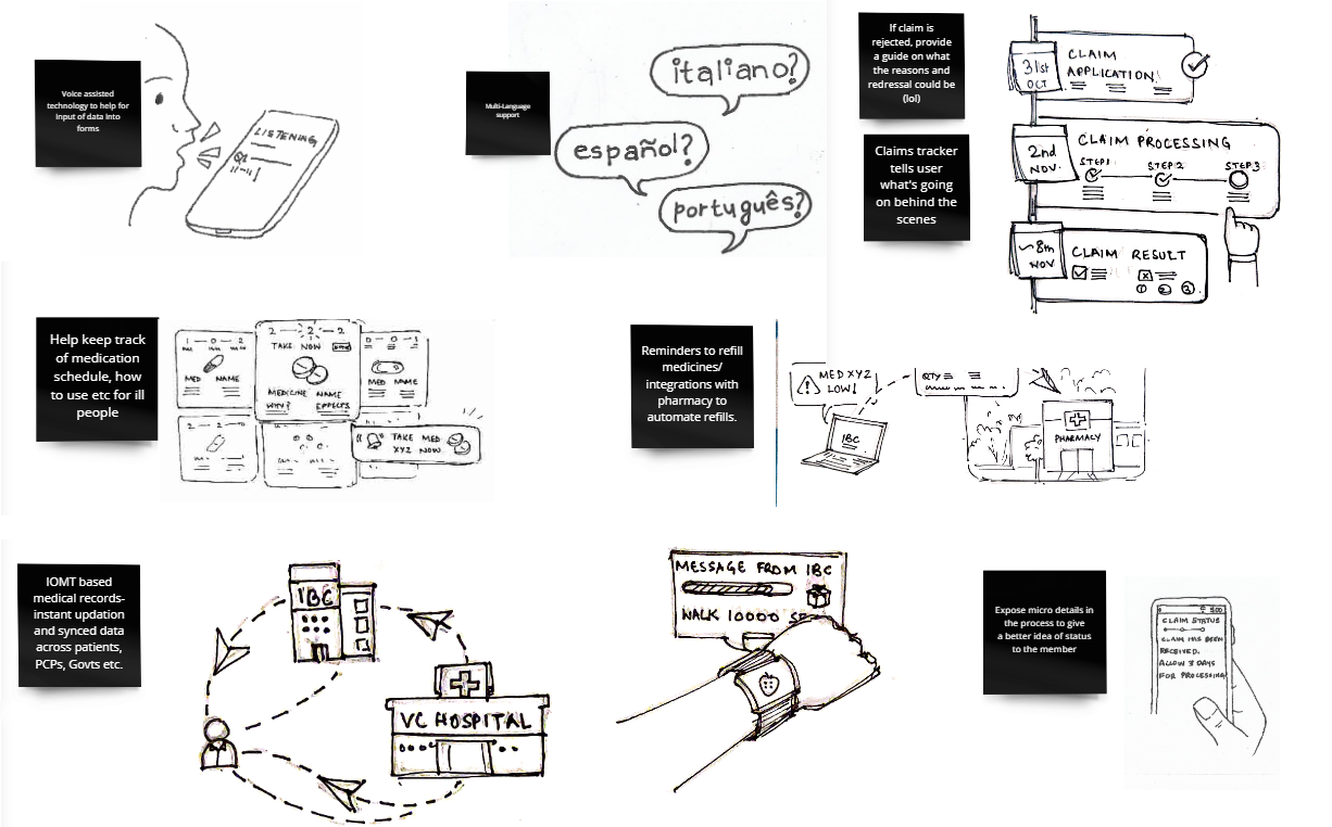
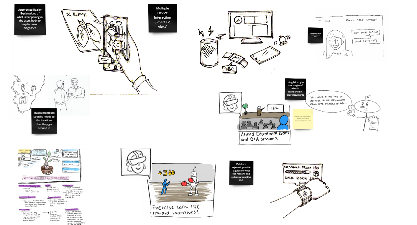
After brainstorming internally and with stakeholders, the different ideas were prioritised and combined into features.
SHORT TERM
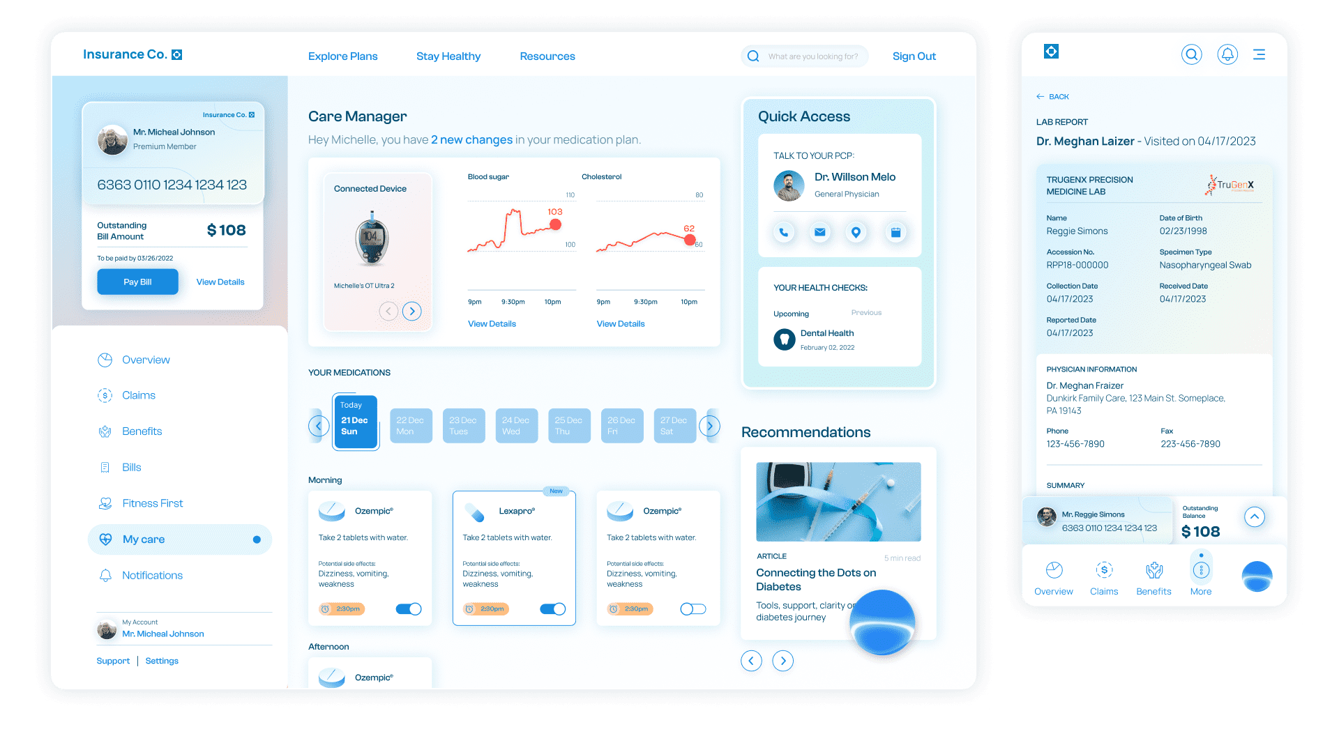
The care manager allows members to connect their devices, educate themselves on what it means to live with their diagnosis, help them track medications and prescriptions, get suggestions on lifestyle changes to help manage a condition, learn how their plan can help, as well as keep them up to date on clinical care options and ways to save.
SHORT TERM
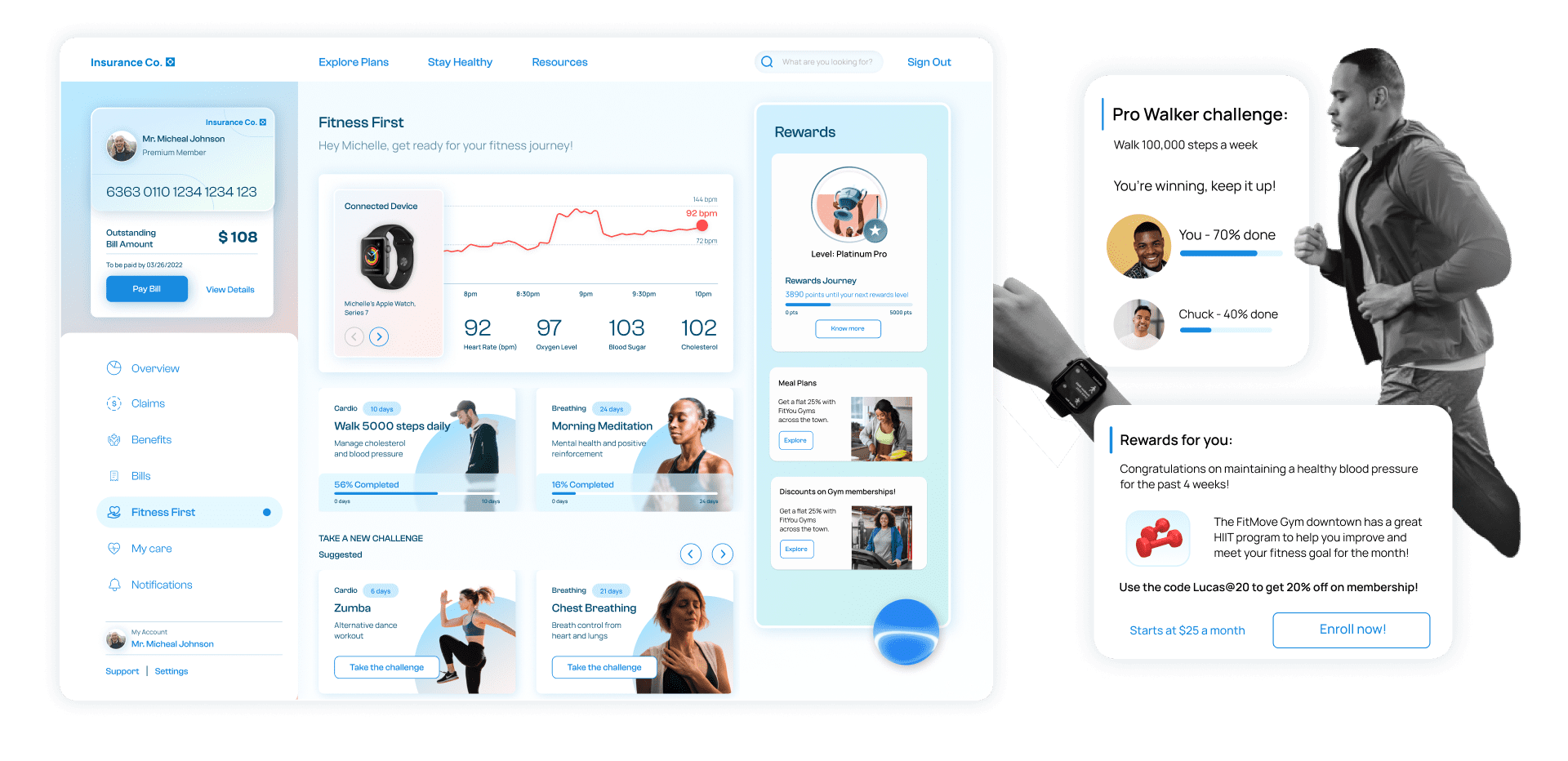
Fitness first focuses on the ongoing health journey by utilizing in-network member connections. It focuses on building healthy futures by engaging with members using challenges, incentives, and nudges relevant to members’ specific diets, health conditions and lifestyles.
Its integration with wearables helps keep health records on the track and ensures real-time updates.
SHORT TERM
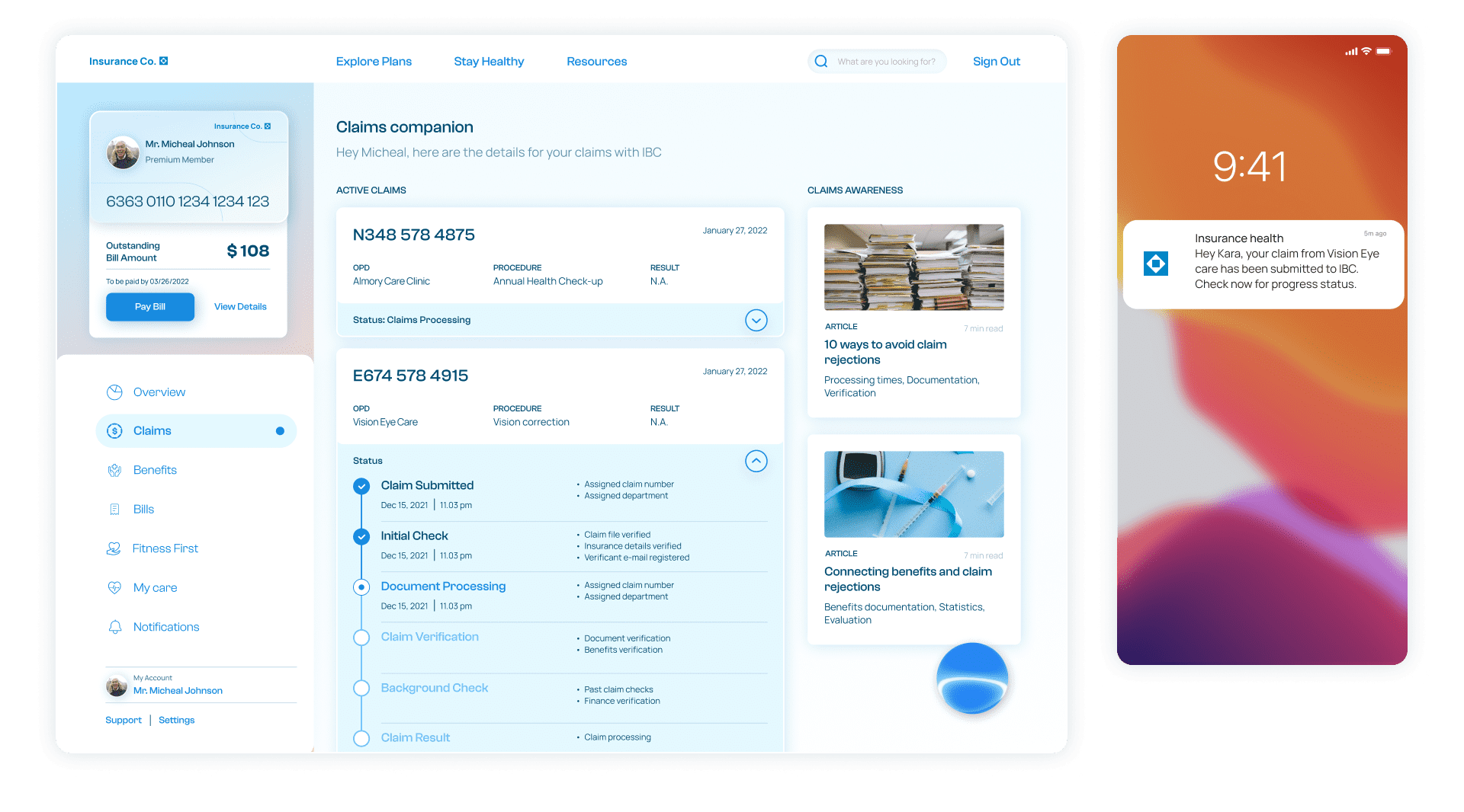
By providing a detailed breakdown of the current claim status, the claims companion keeps the members informed about the progress of their claim. This ensures trust-building and helps members rely on the company's digital platform for basic queries regarding timelines.
It also breaks down the different stages with support options, suggestions in case of denials, applications withdrawal, etc.
SHORT TERM
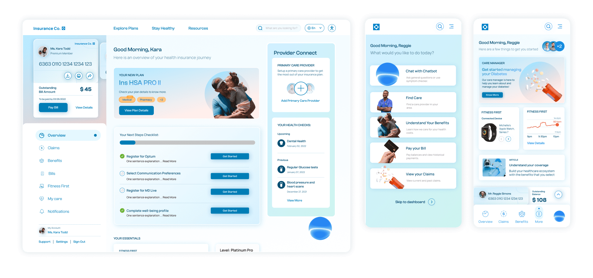
The dashboard is the first interaction and personalized point of communication with the policy holder. The dashboard holds the most important and vital data for the members customized according to persona and context.
The chatbot is an important part of the dashboard which intuitively reaches out to the members with current actions and upcoming tasks, rather than waiting over communication from their end.

SHORT TERM
Provider Connect ensures direct member communication with PCPs and specialists within the insurance provider network. It helps members understand their options based on their location, previous records as well as their search histories.
It helps members with triage, emergencies, and specialist appointments to build a seamless network for care provision. Provider care also alerts PCPs and a relevant network of doctors in case of emergencies or assistance that members might need.
MID TERM
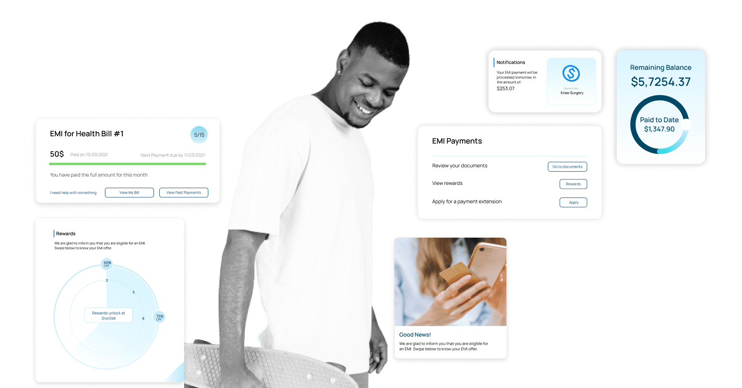
The health wallet is a member personalized savings account that provides EMI options, savings control and rewards based on member participation.
this provides members with incentives,goals and opportunites to save money and plan their financial health journey more efficiently.
MID TERM
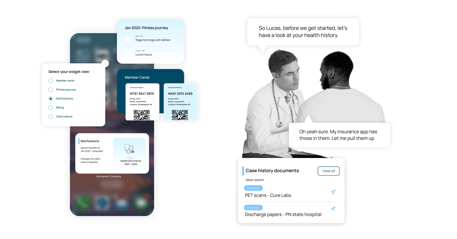
The widget on mobile phones provides context sensitive data from the app to ensure that a member has prioritised information at their finger tips.
This is customisable and updates dynamically to provide content most relevant for a person at every point of their insurance journey.
LONG TERM
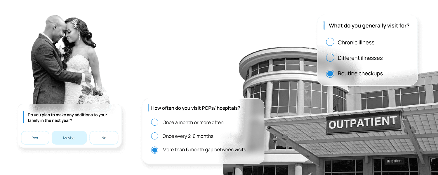
A guided journey meant to uncover a member’s medical needs and future planning to suggest the right benefit options for their lifestyle. Utilizing VR, potential members can walk through a life journey, uncover scenarios, choose events based on their lifestyle and path, and be given suggestions as to what plan fits the needs and expectations uncovered in this journey.
LONG TERM
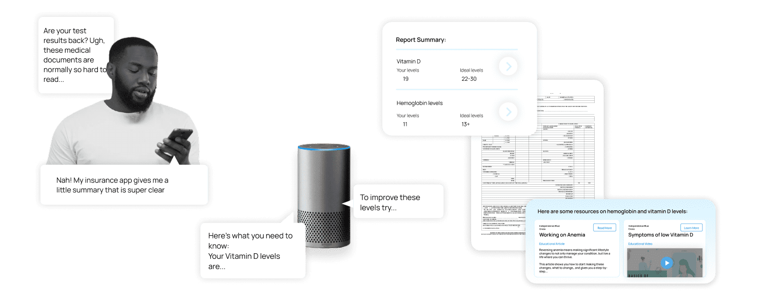
A member guide and teacher to provide help with important information like form filling, important terms, and assistance. It scans your documents and provides easy to understand summaries and contextual explanations, building member confidence and insurance literacy.