Concept 1
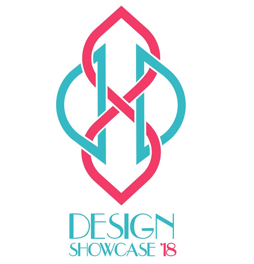
The logo is inspired by a swan, which is hailed as a symbol of grace, beauty and creativity in many cultures across the world. It is made up of the capital letters D and S, which combine to form the shape of the swan.
Create a logo that depicts the exhibition, as well as alluding to the new phase of life that the graduating batch will enter into.
Create a logo for the Design Showcase of Symbiosis Institute of Design, an annual exhibition of the work of the graduating batch.
Understanding more about the exhibition, projects, past years etc. Concept and layout explorations followed by developing a visual style, creating options and arriving at the final design after rounds of feedback.
The logo is inspired by a swan, which is hailed as a symbol of grace, beauty and creativity in many cultures across the world. It is made up of the capital letters D and S, which combine to form the shape of the swan.
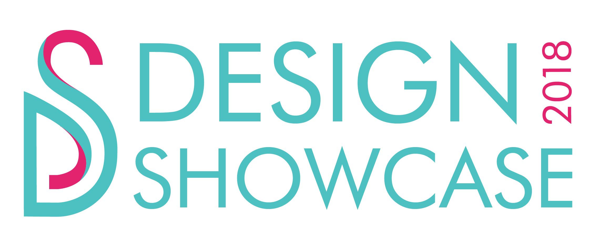
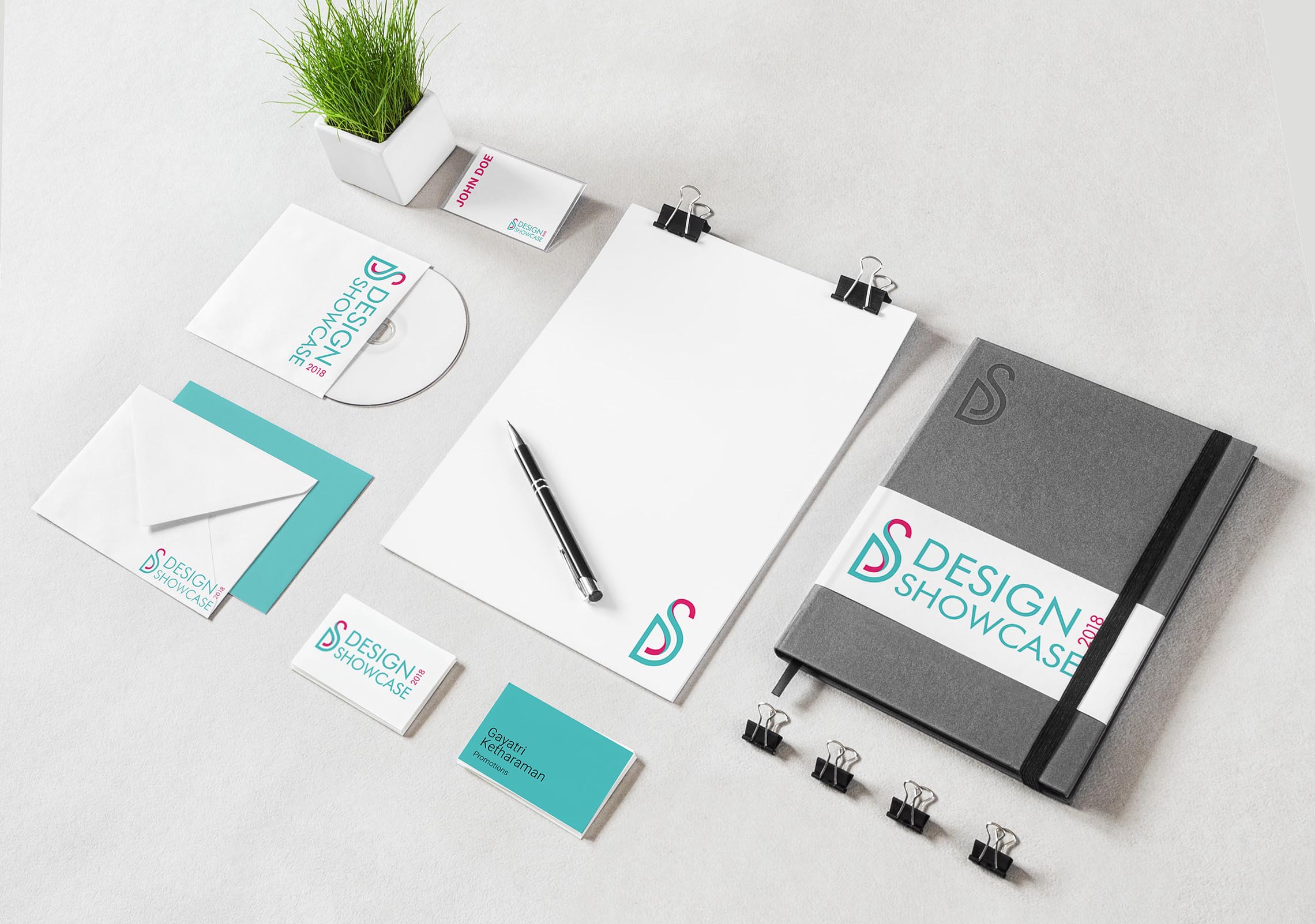
The logo creates a form using the letters D and S mirrored vertically. The four overlapping shapes formed by the letters represent the four disciplines that SID has to offer. These shapes are overlapping and intertwined to denote the interconnectivity of the different branches of design. The shapes are organic to represent flexibilty, and intertwining to represent how the future can lead you to any of these paths.
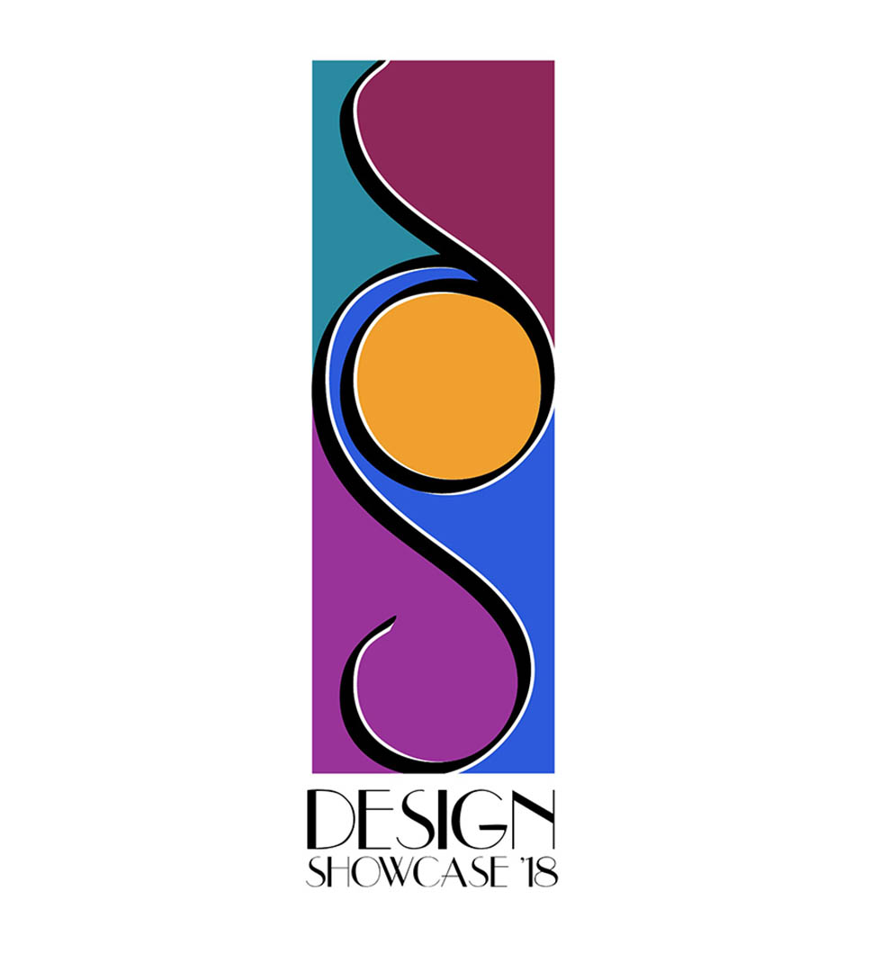
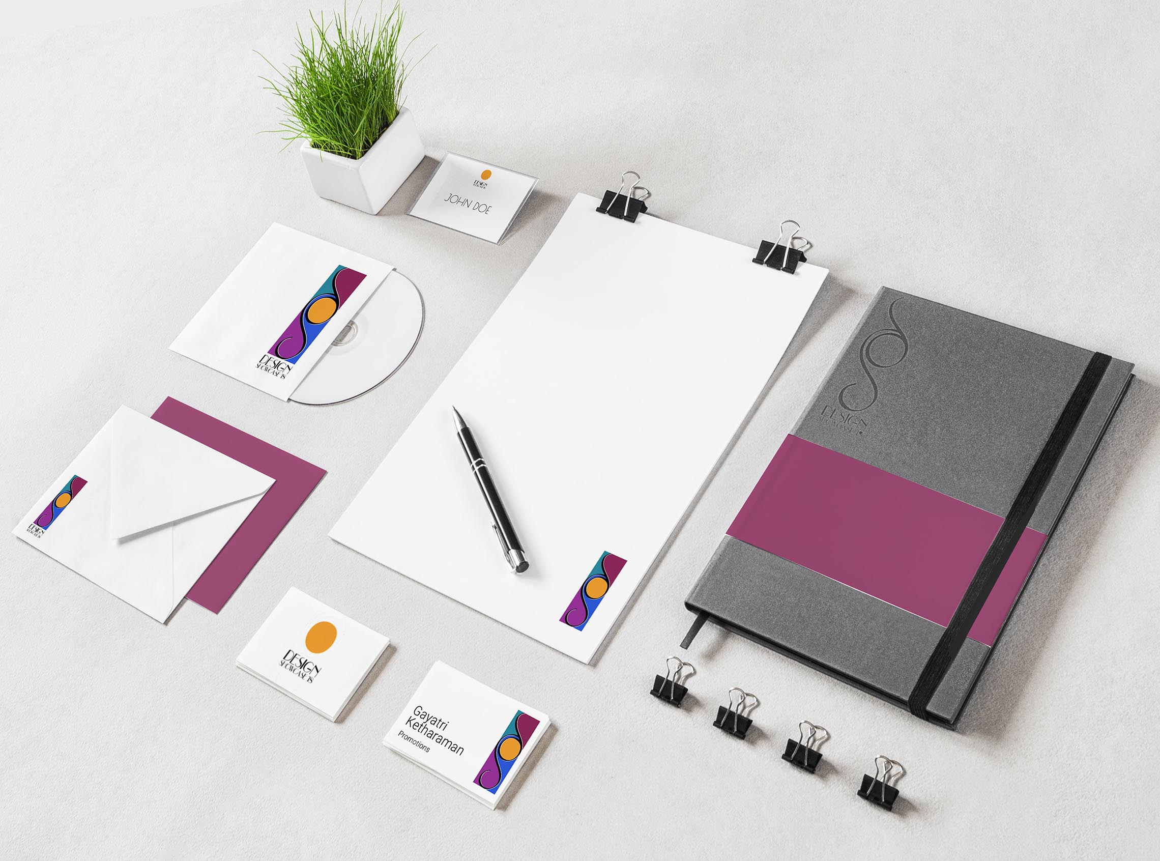
The letters d and s form the black strokes that run through the logo.They simulataneously divide the logo into four parts to represent the 4 disciplines that SID offers, and provide the common thread that connects these complimentary parts, denoting how the Design Showcase celebrates the work of all the disciplines. The yellow in the centre is similar to a sun, representing the bright future that lies ahead of the graduating students.
